" transform="translate(6.667 25)" width="26.666666666666668px"/><path d="M 6.667 13.333 C 10.349 13.333 13.333 10.349 13.333 6.667 C 13.333 2.985 10.349 0 6.667 0 C 2.985 0 0 2.985 0 6.667 C 0 10.349 2.985 13.333 6.667 13.333 Z" fill="transparent" height="13.333333333333336px" id="m1fSvCRzI" stroke-dasharray="" stroke-linecap="round" stroke-linejoin="round" stroke-width="3.33" stroke="rgb(13, 27, 62)" transform="translate(13.333 5)" width="13.333333333333334px"/></svg>)
" transform="translate(5 6.667)" width="30px"/><path d="M 0 0 L 0 6.667" fill="transparent" height="6.666666666666666px" id="CaiNLpJCJ" stroke-dasharray="" stroke-linecap="round" stroke-linejoin="round" stroke-width="3.33" stroke="rgb(13, 27, 62)" transform="translate(26.667 3.333)" width="1px"/><path d="M 0 0 L 0 6.667" fill="transparent" height="6.666666666666666px" id="xGLT9Vw9m" stroke-dasharray="" stroke-linecap="round" stroke-linejoin="round" stroke-width="3.33" stroke="rgb(13, 27, 62)" transform="translate(13.333 3.333)" width="1px"/><path d="M 0 0 L 30 0" fill="transparent" height="1px" id="uv_5VZMDi" stroke-dasharray="" stroke-linecap="round" stroke-linejoin="round" stroke-width="3.33" stroke="rgb(13, 27, 62)" transform="translate(5 16.667)" width="30px"/></svg>)
" transform="translate(3.333 3.333)" width="33.333333333333336px"/><path d="M 0 0 L 0 10 L 6.667 13.333" fill="transparent" height="13.333333333333336px" id="cAUJH_reh" stroke-dasharray="" stroke-linecap="round" stroke-linejoin="round" stroke-width="3.33" stroke="rgb(13, 27, 62)" transform="translate(20 10)" width="6.666666666666668px"/></g></svg>)

Hive’s product team is in charge of everything you see in the Hive app, from new features to small enhancement tweaks. That’s a big job, and involves teammates with specialties across design, engineering, product managers and more.
To keep their work organized and on track, the product meets weekly to run through all of the features, updates, and rollouts happening in the platform. Because the team is made up of multiple specialties and individuals that are often running concurrent sprints in parallel, the meetings serve as a team-wide update and accountability sync to ensure progress is being made across all aspects of Hive.
Before Dashboards existed, the meeting took 3-4 hours to prepare for. Why? Because team members were pulling data and screenshots from the Hive app itself, where the team tracked their progress. They were taking those images and putting them into slides. While not the most glamorous, it got the job done.
But as the team continued to meet, and spend hours prepping for the meetings, they realized there was a better way to optimize their in-meeting time and minimize prep work: Dashboards.
The Setup Before Dashboards
Manual slide assembly every week: The team spent 3–4 hours on Thursdays extracting action card data, project data, NPS metrics and more, then pasting screenshots into a master PowerPoint deck for Friday’s stakeholders call.
Fragmented, time-boxed data sources: Because snapshots were taken at different moments, the final deck stitched together metrics with various timestamps.
Zero interactivity or drill-down: Once exported, slides were static; any follow-up question required digging back into source tools or rebuilding slides for the next week.
Hidden inefficiencies and bottlenecks: Without a live, shared view, backlog creep and blocked cards went unnoticed until they caused delays, costing the team ~30 engineering hours every month.
In 2025, the team started down a different path, utilizing a new Hive feature called Dashboards. Dashboards are real-time, interactive views of work happening not just across Hive, but throughout your entire organizational ecosystem.
The Product Team’s Goals with Dashboards
The goals while transitioning over the Dashboards were simple:
Reduce time spent on manual data updates
Ensure the team is reviewing current metrics that are updated in real-time
Figure out a way to send leadership or stakeholders small snapshots of the information that they needed.
The convenience factor with Dashboards lies in its ability to constantly pull refreshed and accurate “to-the-minute” information from Hive project and tasks. The work you’re already doing in Hive? It’s being pulling into your Dashboard in real-time, so you don’t have to update spreadsheets, decks, or Notes after doing the work.
Dashboards compiles data in Hive into quick-access widgets that tally:
Actions
Projects
Time tracked
Goals
Project status
Risks & Issues
And more
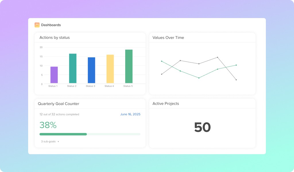
That data can then be displayed in a variety of chart types and graphs, depending on your team’s preferences. But Dashboards doesn’t stop there…users can also embed other data sources or apps like Hubspot, Datadog, Jira, Salesforce, Dropbox, and even something like Spotify.
Building the Living Dashboard
Leveraging interactive Dashboards, Hive’s “Stakeholders” Dashboard streams live ticket updates, Datadog, community forum votes, and NPS data into a single interactive slate, giving Friday’s leadership call sub-hourly metrics with one-click drill-downs to the underlying stories.
By eliminating manual slide builds, the system keeps data current to the minute and returns more than 1,200 dev-team hours a year to actual product-development work.
Hive Dashboards lets our team see all their key numbers—workload, customer feedback, performance, revenue—in one live, interactive screen. Instead of building slide decks or jumping between apps, anyone can open the dashboard, click into a metric, and instantly explore the up-to-date details behind it.
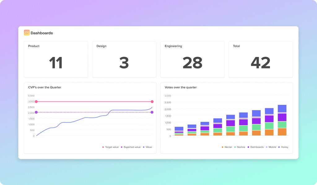
Here’s a breakdown of some of the hero stats that our team focuses on:
Per-Pod Status Counters – live counts of actions in each pod broken down by workflow status giving managers an instant snapshot of where work is concentrated and where it might be piling up.
Healthy-Pod Story Count (≤ 400) – a live gauge that flashes red when any engineering pod’s total open stories rises above the agreed 400-card threshold.
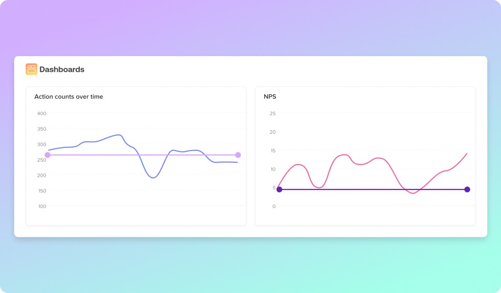
Customer-Vote Delivery (CVPs) – a running tally toward the quarterly goal of shipping 3 000 community-voted points, plotted week-over-week.
Net Promoter Score (NPS) Trend – a goal widget showing the team’s rolling average NPS line against the desired target.
Blocked Cards Counter – a single click-to-drill number revealing every story currently impeded, so the team can unblock them during the meeting.
Oldest Cards Table – highlights aging stories in each pod to keep work fresh and customer-relevant.
Status-Duration Metrics – time-in-stage charts (Design, In Dev, QA, etc.) with target days, exposing bottlenecks in the delivery pipeline.
All of this lives at a single URL. Anyone with Hive access could filter by pod or sprint, then click on any worrying number to open the exact list of cards behind it.
Outside advisors received a scheduled PDF or a public link that preserved interactivity without even logging into Hive.
The Impact of Dashboards
Six months after launch, Hive’s analytics team ran the numbers:
Time saved: roughly 1,200 dev-hours reclaimed across the product team alone—equivalent to an extra sprint every quarter.
Decision speed: 80% of Friday’s meeting now devoted to action items rather than status recitation.
Backlog hygiene: active stories held below 400 for sixteen consecutive weeks, a feat never achieved under the slide regime.
Template adoption: three additional departments are in the process of cloning the Stakeholders Dashboard, projecting additional company-wide savings in 2025-2026
But the metrics tell only half the story. The qualitative shift—leaders making choices based on up-to-the-minute truth rather than yesterday’s guesswork—has unlocked product velocity impossible to measure.
Features aligned with the hottest community votes ship weeks sooner; NPS has trended steadily upward; engineers feel their work is visible and celebrated in real time.
A Call to Every Team Still Living in Slides
If your Thursdays vanish into copy-paste limbo and your Friday charts expire before lunchtime, Hive’s experience offers a way out. A real-time, clickable dashboard won’t just save hours; it will surface truths you never had time to find, and give your team the freedom to focus on the work that matters.
CTA – Reach out to us at marketing@hive.com to get a copy of our Stakeholders dashboard and secure a session with our team to help build out your dream Dash.


" height="21.708px" id="ocyW7qRll" transform="translate(1 1)" width="22.825000000000003px"/></svg>)
" width="23.345px"/><path d="M 16.453 17.099 L 19.081 21.658 C 15.218 24.615 9.208 24.973 4.759 21.568 C -0.024 17.954 -1.4 11.36 1.539 6.134 C 4.692 0.594 10.591 -0.631 14.389 0.266 C 14.288 0.489 12.013 5.209 12.013 5.209 C 12.013 5.209 11.833 5.221 11.731 5.223 C 10.609 5.271 9.772 5.532 8.876 5.995 C 6.879 7.037 5.529 9.002 5.271 11.239 C 5.139 12.357 5.294 13.49 5.721 14.53 C 6.081 15.41 6.591 16.192 7.276 16.852 C 8.326 17.866 9.576 18.493 11.026 18.701 C 12.397 18.898 13.716 18.703 14.953 18.081 C 15.416 17.849 15.811 17.591 16.273 17.239 C 16.331 17.201 16.383 17.153 16.453 17.099 Z" fill="rgb(255, 73, 44)" height="24.000281511058695px" id="XZw0UJF9D" transform="translate(0 0.001)" width="19.081280403406165px"/><path d="M 5.071 2.811 L 4.431 2.182 C 4.308 2.06 4.19 1.933 4.063 1.814 C 4.018 1.771 3.965 1.712 3.965 1.712 L 4.026 1.584 C 4.268 1.098 4.647 0.744 5.096 0.461 C 5.593 0.146 6.173 -0.014 6.761 0.001 C 7.514 0.016 8.214 0.204 8.804 0.708 C 9.24 1.081 9.464 1.554 9.503 2.118 C 9.569 3.069 9.175 3.798 8.393 4.308 C 7.933 4.606 7.438 4.838 6.941 5.112 C 6.667 5.263 6.432 5.396 6.164 5.67 C 5.929 5.945 5.917 6.203 5.917 6.203 L 9.477 6.199 L 9.477 7.784 L 3.982 7.784 L 3.982 7.631 C 3.962 6.852 4.052 6.119 4.409 5.411 C 4.737 4.762 5.247 4.287 5.859 3.921 C 6.332 3.639 6.829 3.399 7.302 3.118 C 7.593 2.945 7.799 2.692 7.798 2.324 C 7.798 2.008 7.568 1.727 7.24 1.64 C 6.466 1.431 5.678 1.764 5.269 2.472 L 5.071 2.812 Z M 11.957 14.561 L 8.957 9.381 L 3.02 9.381 L 0 14.615 L 5.98 14.615 L 8.932 19.771 L 11.956 14.561 Z" fill="rgb(255, 73, 44)" height="19.770929946899415px" id="twZYfi9ck" transform="translate(11.391 0.852)" width="11.957px"/></g></svg>)